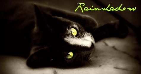
Rainshadow's Graphics

How are my graphics?

  • Amazing!

    Votes: 5 41.7%
  • Cool!

    Votes: 3 25.0%
  • Good!

    Votes: 2 16.7%
  • Okay.

    Votes: 2 16.7%
  • I don't care for them.

    Votes: 0 0.0%
  • They're awful!

    Votes: 0 0.0%

  • Total voters
    12
@GG: I know!

@Ice: Haha, yeah, I really liked that one. :D

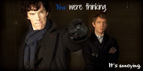
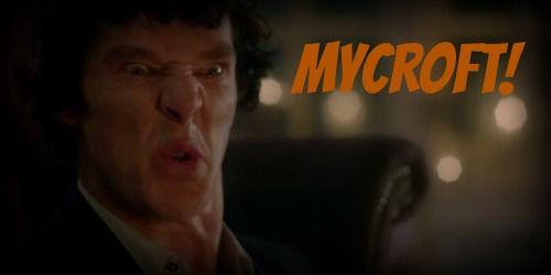
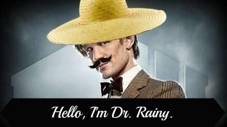
@Hyper: Thanks for your advice! I've been trying to figure out different text stuff and all that, and for the last graphics I made (the 2 Sherlock ones), I tried to stick with white and a blue light enough to be seen, yet dark enough to look like Sherlock's scarf. Naturally, that was very hard to do!
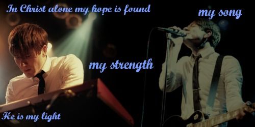
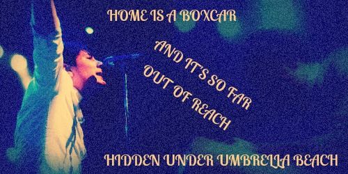
Also, when I look back on the 1st Embers banner, I don't really like how I did it. At the time I thought it was really cool, putting the lyrics at different spots, but now that I look at it, I realize that it made it hard to see. Also the text was very thin, which doubled the pain it took to read it. :rolleyes:
 
Alrighty, so, I was looking for a Sherlock picture to make into a banner, found one and started messing around with it when Watson noticed. She immediately went: "Ooh! I love that picture! When you're done, I'm so gonna use that."
So here you are, Watson, two banners for ya! I'll probably be making an avatar out of it, too.

Watson2_zps7825926c.jpg


Personally I like the first one more. And I just love John's face! It looks like he's chewing gum or something, lol.

I would like to steal this one. May I?
 
cat2_zpsa4466093.jpg


...Yeah, I got bored.

WOAH! I actually really love this one! The color is perfect, and so is the font! 10-10

Oh, how I want to read!

books1_zpsc79fe4e9.png


On an off note, I was kinda bored the other day, so I decided to draw some of my Redwall characters:

http://i1352.photobucket.com/albums/q656/MoonfishParachutist/Shadow_zpsea86b639.jpg

http://i1352.photobucket.com/albums/q656/MoonfishParachutist/0011_zps388f0792.jpg

The two drawings are really good! I'm horrible at drawing animals; I definitely understand how hard it is. Great job!

The "reading" graphic is fairly good. I love the font, but I think the "reading" word, needs to be moved over to the left a tad (so it isn't overlapping the book) I also think the words on the bottom could have been left out, made into two lines, or made smaller so as to fit in the lighter section of the book. (where the words overlap the dark section of the book, they're a little hard to read.)

Hats off, though. I'm really impressed with this batch of graphics! Great job :)

And remember, I'm in no way trying to criticize your graphics. I'm just letting you know how I would think it would look better (generally). If it gets to you, let me know, and I'll stop :p. Also, feel free to critique my graphics whenever you'd like!
 
Thanks for the criticism. It is much appreciated. :)

Random siggy that I made from reading someone's Tumblr account:

adam4_zpsf868d6c2.jpg


<3 I am very much in love with it! :D
 
Sorry for the double post, but here's another thing I made. It's a horrible drawing, but I was doing it on the computer. I've never drawn anything on the computer before. :rolleyes:

59d5c6a5-c3f0-4e30-9383-b15da45a6e02_zps6198830f.jpg
 
Thank you! :D

Here's another I made.

adam004_zps622d3dd8.jpg


It's really grainy, yes, and it's supposed to be. The pics clashed, and that was the way I fixed it. ;) Unfortunately, because I made it so grainy, you can't see the second pic very well. :(
 
I can't really see a second picture but I think it still looks really cool. My main thought on all of your graphics, by the way, is still that the text doesn't really match the banners, it's just kind of sitting on top of the banner and not an integral part of it.
 
Yeah, they have their own little meanings to me, 'cause I go down little bunny trails to find them. Then when I find one that works, I put what I originally thought. It works for me, 'cause it's a way to remember my strange struggles to make stuff. :rolleyes: They don't always fit, but I do 'em anyway. ;)
 
Yeah, they have their own little meanings to me, 'cause I go down little bunny trails to find them. Then when I find one that works, I put what I originally thought. It works for me, 'cause it's a way to remember my strange struggles to make stuff. :rolleyes: They don't always fit, but I do 'em anyway. ;)

I'm not talking about the meaning of the words fitting the pictures, I think they always fit really well. I mean style-wise and graphically they look like exactly what they are, words added on top of a picture, when they could be a more integral part of the picture.
 
Dr. Rainy (me) took over Rain's account, seeing as she's spending the week with Hitler so they can complete their chess tournament. Seeing as I took over her account (hehehe), I decided to make myself my own theme for when I'm on (which is all the time, since really I'm just a figment of Rain's imagination, created for this forum).

My avatar:
drainy1_zpsf647af45.jpg


My banner:
drainy02_zps42b9ec52.jpg


Yes, my mustache looks a wee bit different in the pictures. I was sort of going through a phase during the first picture. I thought that if I put enough goop in my 'stache, I'd look cooler. Unfortunately, I was wrong.

EDIT: There we go! A picture (it looks quite the same, I know! Strange, isn't it?) where I have a nice mustache:

drainy1_zps15345fc6.jpg
 
Last edited:
Back
Top