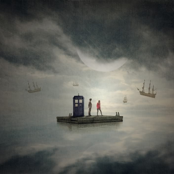
Fantasy Pond
Thank you for the comments Miss D and Annemarie!
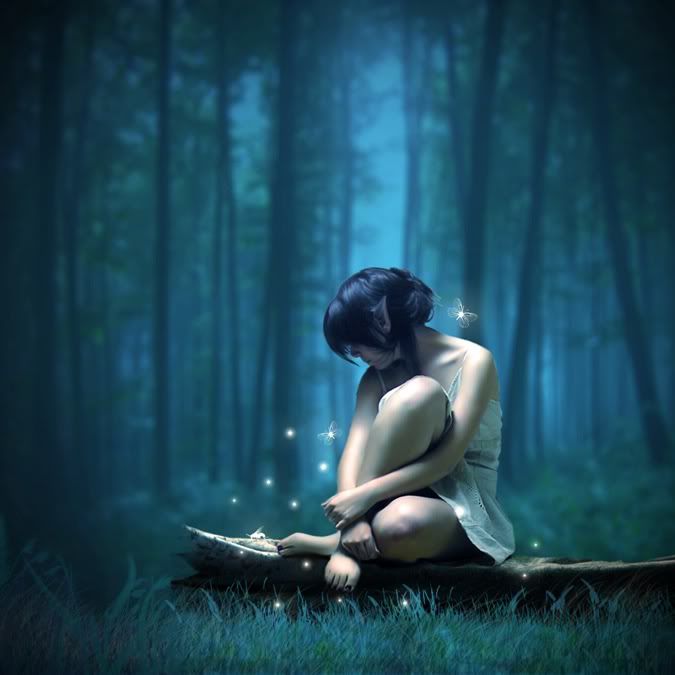
And now to finish up with my current Amy Pond's obsession, here's the last one with Amy Pond (for now)! As usual, this graphic is available on a larger size from MediaFire.
This one took me A LOT longer because I used a composition of two photos, one of the forest and one PNG I made of Amy Pond. The tutorial for this had only one photo and the colors were of a completely different palette. What that means is that when it came to the color adjustment steps, my colors would be completely wrong. I had to come up with my own adjustment layers to get the effect I wanted. But the tutorial was still pretty awesome!
Here is the result.
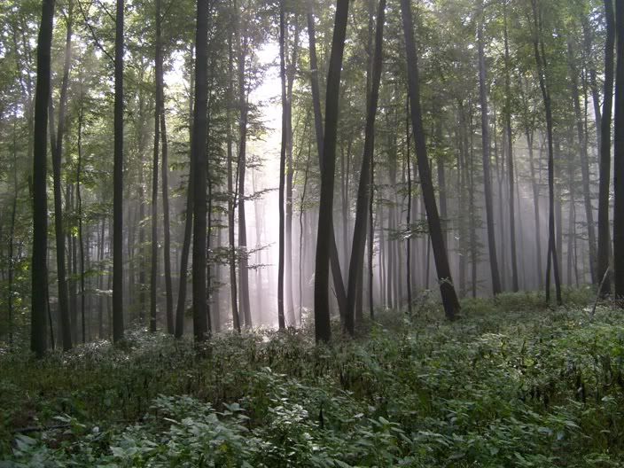
And this is the original background I used. See the changes?
Learning Photoshop is really tiring! I'll take a short break ok?
Thank you for the comments Miss D and Annemarie!
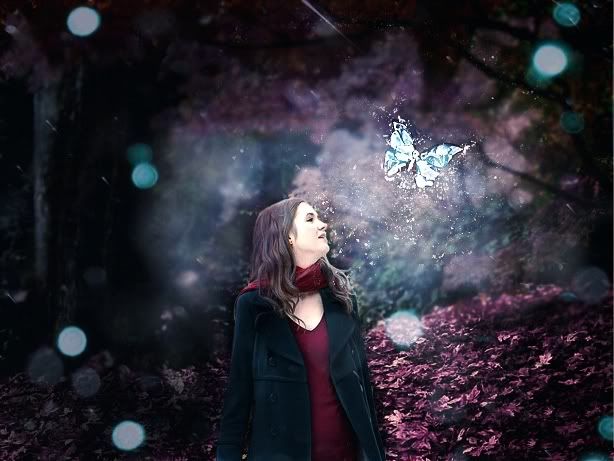
And now to finish up with my current Amy Pond's obsession, here's the last one with Amy Pond (for now)! As usual, this graphic is available on a larger size from MediaFire.
This one took me A LOT longer because I used a composition of two photos, one of the forest and one PNG I made of Amy Pond. The tutorial for this had only one photo and the colors were of a completely different palette. What that means is that when it came to the color adjustment steps, my colors would be completely wrong. I had to come up with my own adjustment layers to get the effect I wanted. But the tutorial was still pretty awesome!
Here is the result.
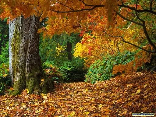
And this is the original background I used. See the changes?
Learning Photoshop is really tiring! I'll take a short break ok?
Last edited:
 You're so good at photoshop!