Aslan's Child_1996
New member
wow i love it! 10-10! :d nothing to comment, it's just great in every way!
thanks so much, patrick!!!!!!!!!! I am soooooo glad you liked it!
wow i love it! 10-10! :d nothing to comment, it's just great in every way!
thanks so much, patrick!!!!!!!!!! I am soooooo glad you liked it!
 Lol. I love how you were able to make the colors more vivid, and stand out, and then adding the border. The text on that was perfect! Good job on that.
 Hey, Ive been following this thread, but haven't posted so far.
So, I think your graphics got a lot better when you switched to the new program. I love the first one you did with the new program, that Tangled one.
The first Hunger Games one, the one with the tiled effect; I think it created the effect that you desired. It has that 'out of focus' feel, that kind of out of it feel to it. Great job.
I agree with Hyper in that I feel the banner in your signature is too crowded.. but its a great idea.
And the War Horse graphic, I think the text was a bit too funish for the banner.. But other than that, its a great graphic.
all in all, I love your graphics. Keep up the good work!!
Here is one for The Hunger Games. It's okay, but I wish I could have made it better. Enjoy!
****
This is my new banner! It's a bit small, in my sig, but it works!
***
That's a really good one!
Thank you for posting that!
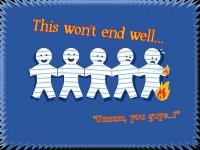
This one is just for laughs! Hope you all enjoy it!
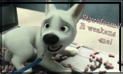
This graphic says it all!!!! Comment below if you feel the same way! Or if you just like the graphic!
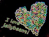
Check this out! Something else I did on http://www.befunky.com
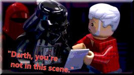
Who likes LEGO Star Wars? This is a posterized scene from "The Padawan Menace"! I learned how to take screenshots of my pc, loaded this video, and then paused it right here to take a screen shot!
Hope you like it!!
Okay, my last one for the day!
...